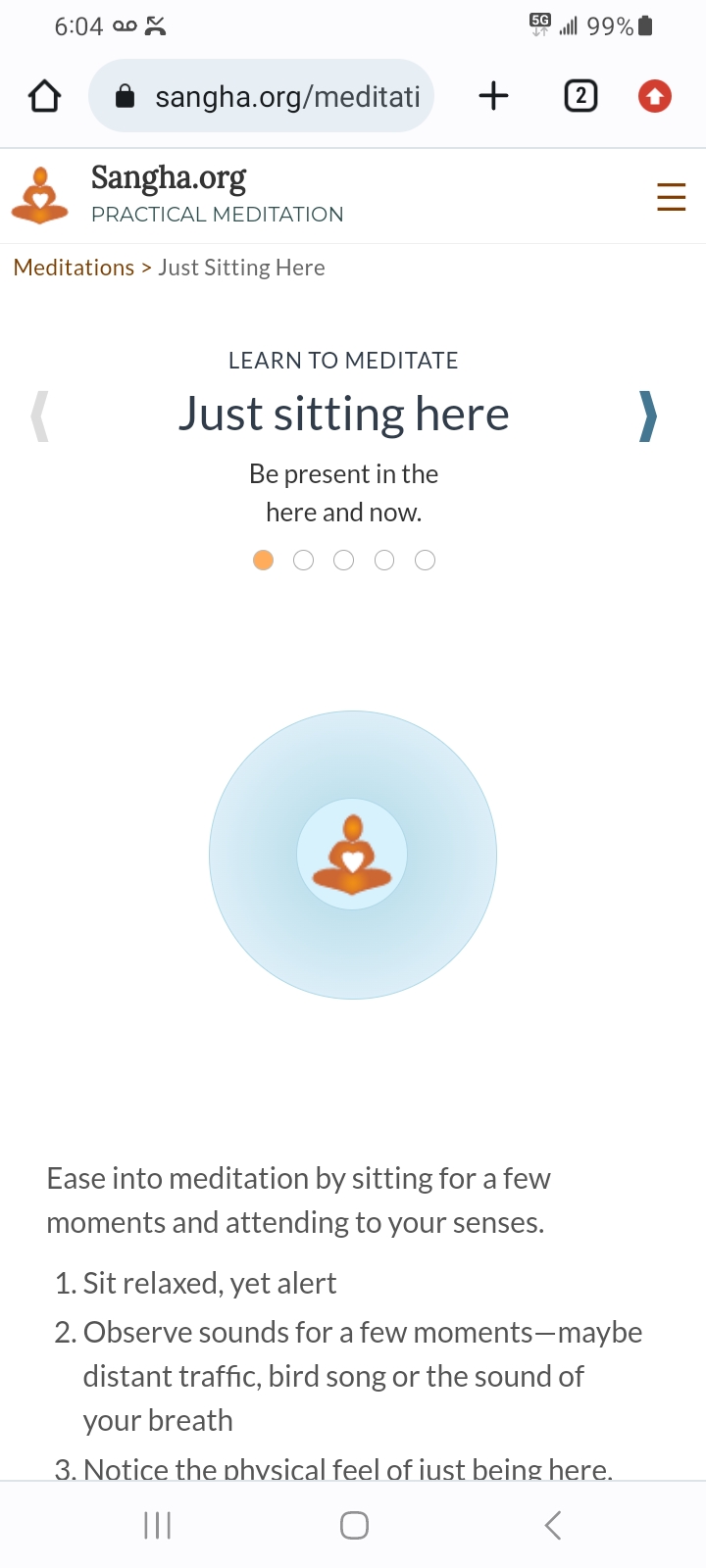
Case studyLearn to meditate

Illustration of a meditator

Project Overview

The Product

A meditation guide that leads beginners through the meditation process in small learnable chunks and can be done on the go

Project Duration

8 weeks

Learn to Meditate, initial screen

Project Overview

The Problem

When stress comes calling and technology isn't available, users need to know how to manage their physical, mental and emotional states of being in order to perform tasks to their best ability.

The goal

To give people an active, engaging way to learn how to meditate in easy-to-learn steps so that they can better maintain healthy responses in crucial, unexpected moments

Project Overview

My role

I worked on this project independently, which allowed me to work each step of the design-thinking process as a UX design student with web development experience.

Responsibilities

  • Performed competitive audit
  • Researched subject matter
  • Performed deep-dive task analysis
  • Created personas, user journeys, empathy maps and user flows
  • Designed wireframes, mockups and prototypes
  • Did informal user testing

Understanding the user

  • User research
  • Personas
  • Problem statements
  • User journey maps

User research: summary

To understand confusion, frustration and other requirements, I conducted user research through in-person (qualitative) interviews. I made the assumption that users would get confused about the buttons that change breath length on screen 2, "Follow the breath." That assumption was correct.

The informality of the sessions made it difficult to get past friendliness bias and obtain other fresh insights about the flow. It did, however, reveal common misconceptions about meditation.

Time constraints and lack of resources prevented quantitative research.

User research: pain points

  • 1 Pain point

    Users of popular meditations may feel more stressed when they don't have technology available.

  • 2 Pain point

    Users of popular meditations may feel lost without technology as their backbone.

  • 3 Pain point

    Many users of popular meditations don't know how to meditate or what it actually entails.

  • 4 Pain point

    Many users of popular meditations confuse meditation with relaxation or other activities.

Persona: Maria

Problem Statement

Maria is a mom and professional woman who needs to combat accumulating stress while at work because the intensity of the workday is beginning to cause emotional and health issues.
Persona, Maria, working professional Maria
  • Age: early 40s
  • Educ: college
  • Town: suburbs
  • Family: 2 kids
  • Occup: mgmt
"I'm sad because by the time I get home I have no energy left for the kids and I lose my temper with them."
  • Goals

    My goal is to manage stress better in order to raise and support my family well.
  • Frustrations

    It's hard to de-stress quickly and I can't readily take time off.
Maria juggles the demands of parenthood and work. Free time is scarce. She takes pride in how well she can manage her responsibilities. Recently, she has been feeling less energetic and more annoyed with the kids.

User journey map

The journey map reveals what Maria does and how she thinks and feels as she achieves her goal of reducing stress with the 5-step meditation sequence.

Persona: Maria

Goals: Reduce stress while at work without lengthy technology sessions
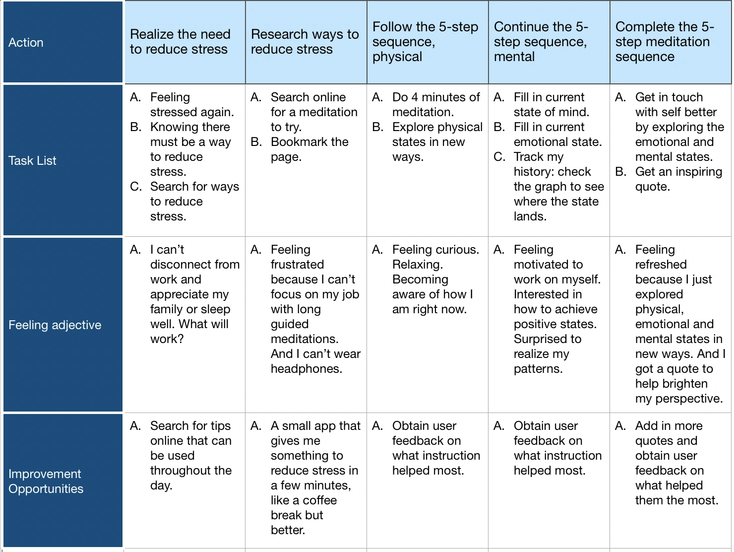
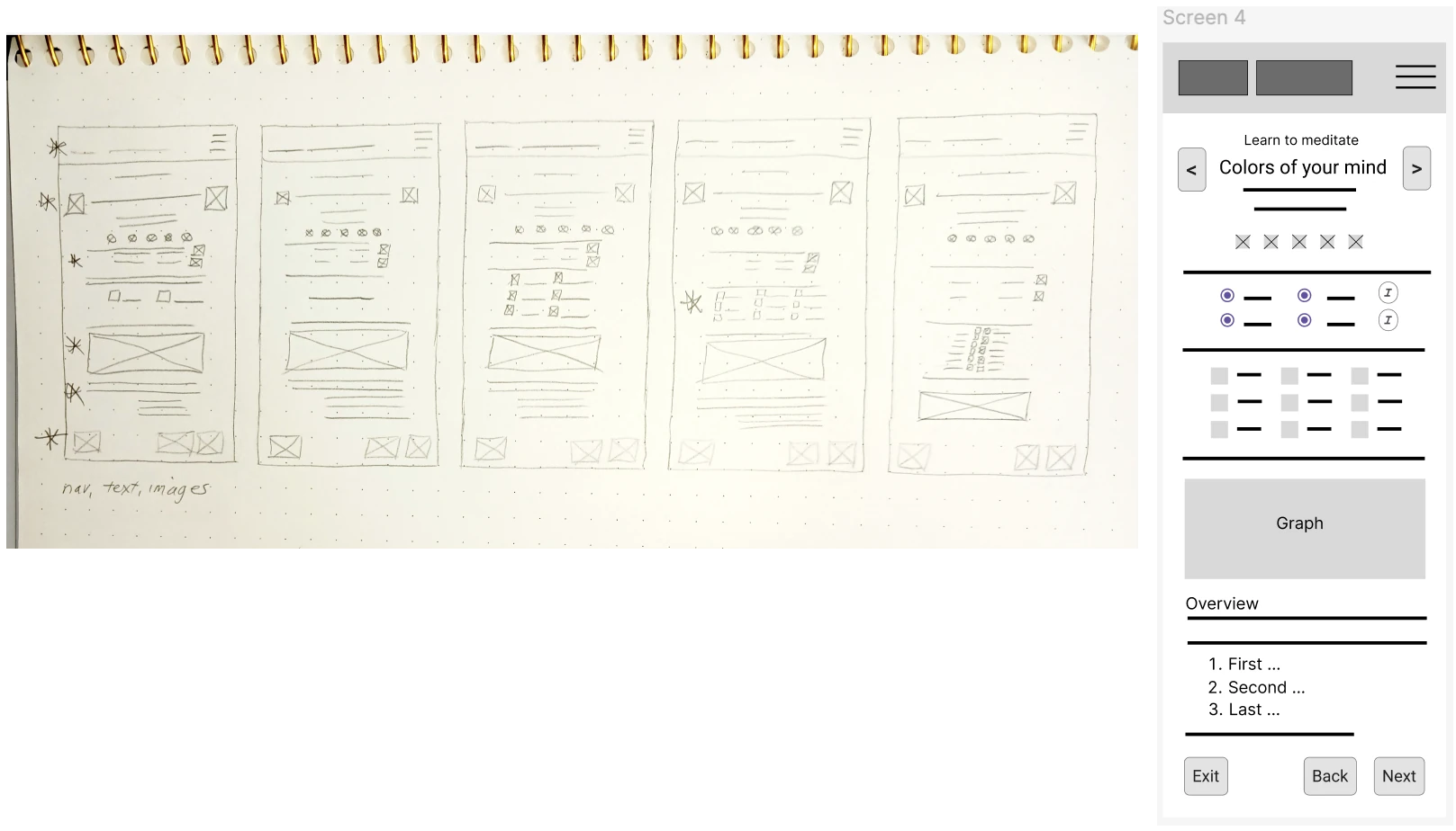
 User journey map

Starting the design

  • Paper wireframes
  • Digital wireframes
  • Low-fidelity prototypes
  • Usability studies

Paper wireframes

I sketched 5 versions of each screen in the flow before deciding on the final version. The highly similar structure of each page greatly simplified the process. I chose to show screen 4 here because it had the most detail plus the strongest alignment with user research.

This sketch, and others, can be seen in Figma.

https://www.figma.com/design/7COHfI1alLjvoH6dnOb1h4/Example-1?node-id=0-1&t=lM6KQI3cyuyoA2po-1 Paper wireframes

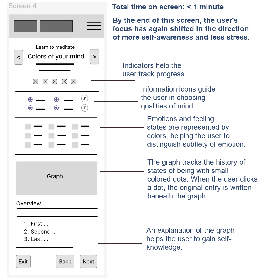
Paper wireframes - benefits

Benefits connected to user research are shown here using "Colors of your mind" as an example.
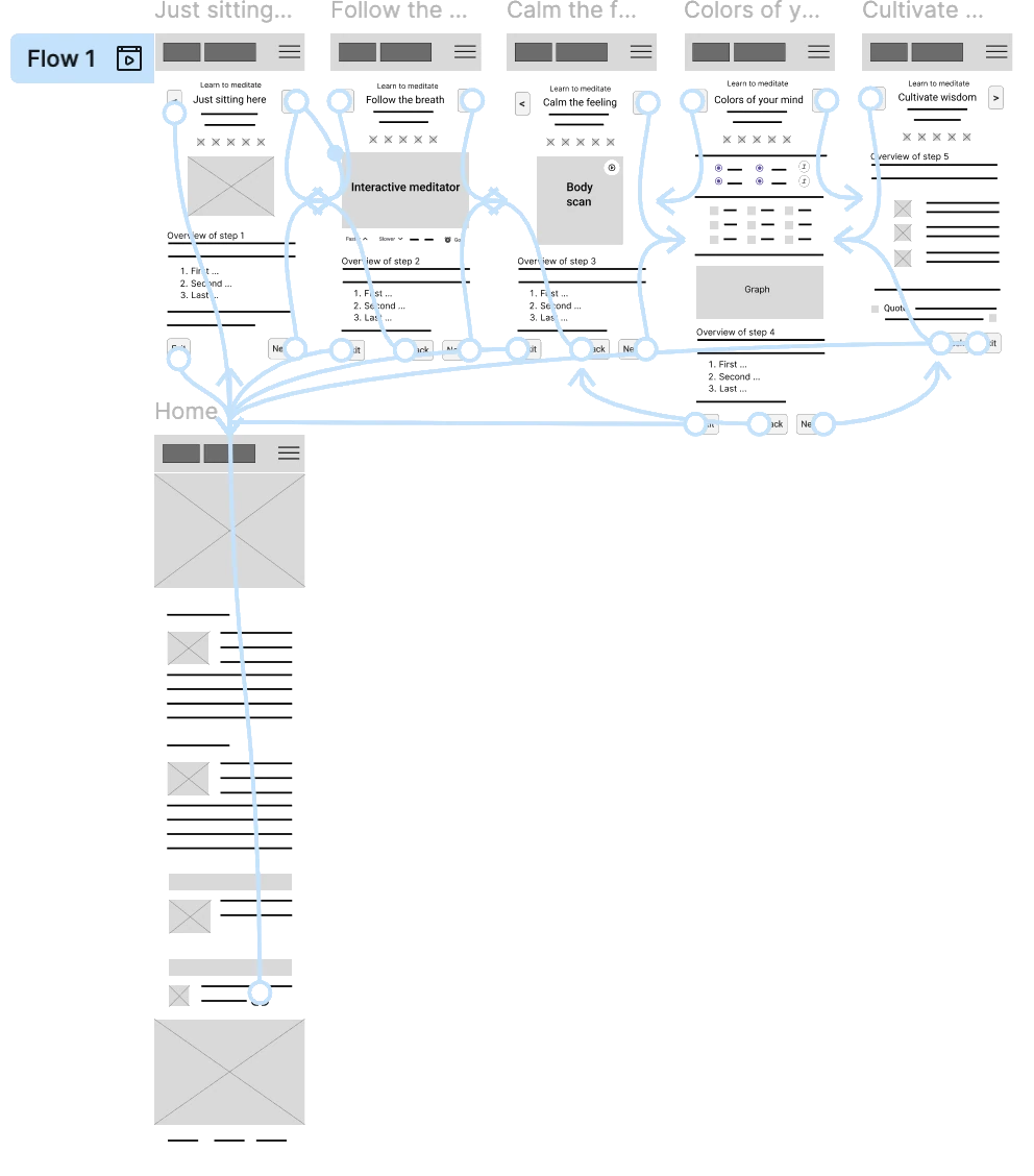
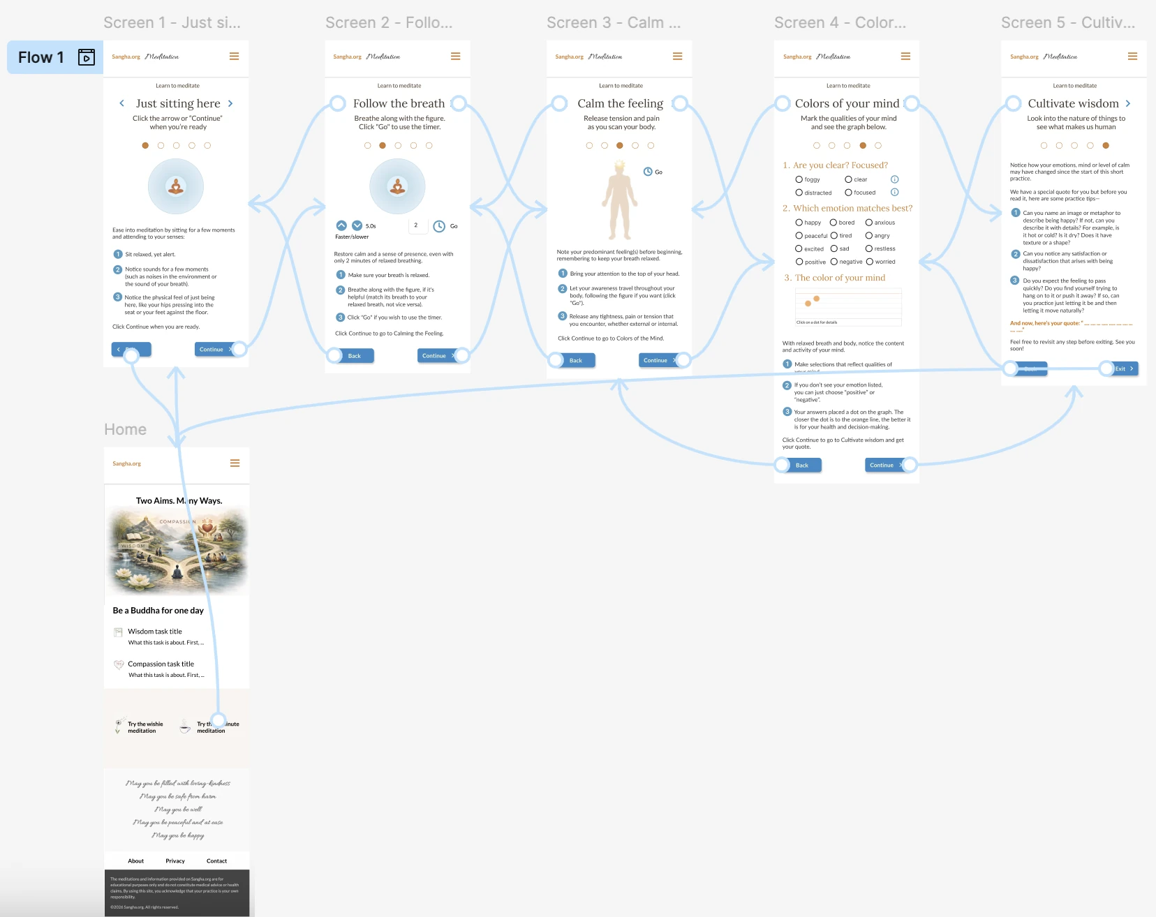
Paper wireframe benefits to users

Prototypes

The flow for learning to meditate is simple because of highly similar page structure. It begins with the landing page and ends at the landing page via the "Cancel" button on screens 1-4 or the "Exit button" on screen 5.

Traversing the flow is done by either the left and right chevrons in the header or the "Back" and "Next" buttons at the bottom.

Please note, the landing page has been re-designed since the completion of this work.
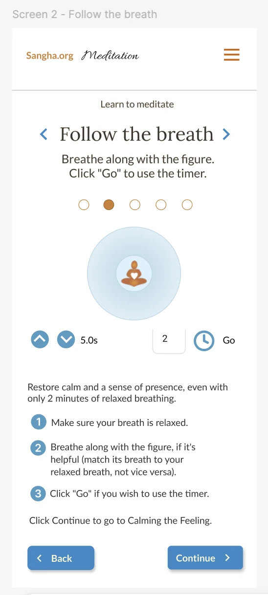
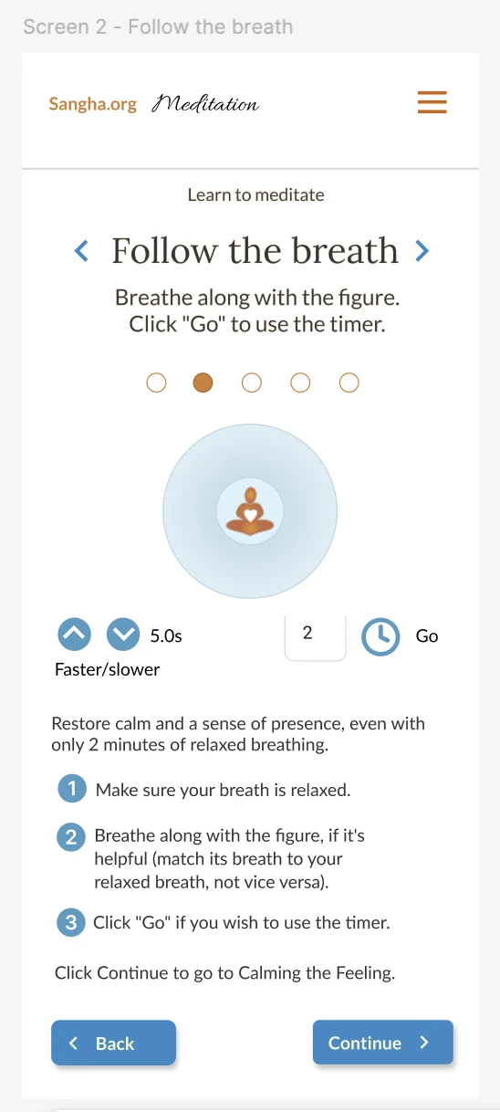
See the prototype.

Prototype

Usability Findings

My usability studies were informal. Despite that, they revealed valuable information.

  • The navigation through the flow was simple.
  • The buttons under the breathing figure in screen 2, "Follow the breath" were confusing:
    1. While looking at the figure, the natural reaction was to either slow down or speed up the figure's breathing.
    2. Because the buttons were addressing breath length and not breath rate, when the down chevron was tapped, the figure's breathing sped up—opposite user expectation.

Refining the design

  • Mockups
  • High-fidelity prototypes
  • Accessibility

Prototypes

The goal was to make sure users understood the purpose of the buttons under the breathing figure.

When the users were asked how they would slow down the breathing (i.e. make the breath longer), they clicked the down chevron.

The result of clicking the down chevron, however, was that the breath length shortened, opposite the expected behavior—it actually sped up the breath.

Screen 2 for Learn to Meditate Screen 2 for Learn to Meditate

Mockups

Mockups

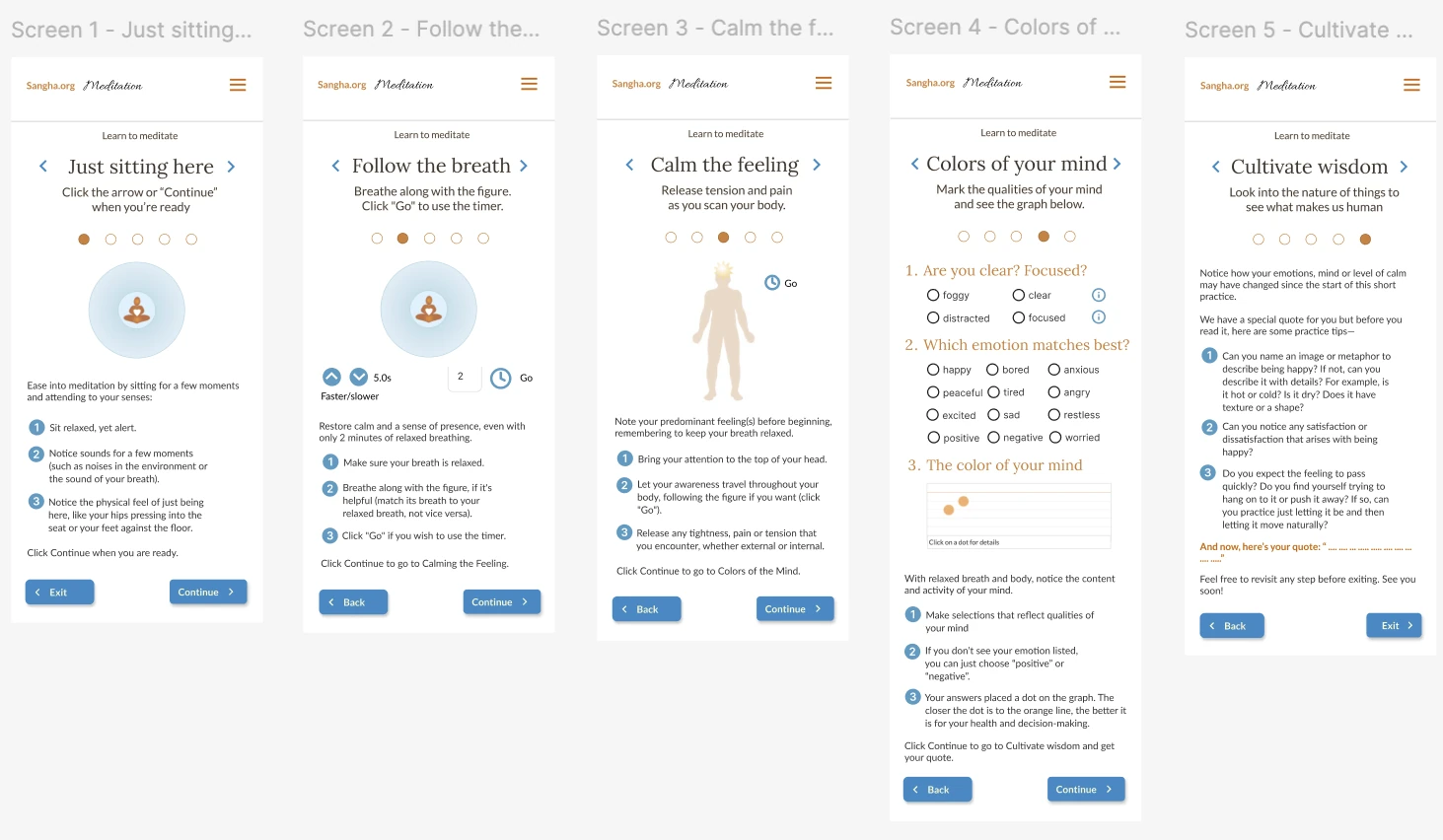
High fidelity prototype

Accessibility considerations

  • 1

    I considered foreground and background colors for adequate contrast. Most (99%) of my work fits within WCAG AAA.

  • 2

    I chose font hierarchy carefully and maintained a font size of 16px for body copy.

  • 3

    I considered white space around clickable items carefully to prevent incorrect clicks.

Going forward

  • Takeaways
  • Next steps

Takeaways

Impact

A great accomplishment!

What I learned

I've learned a lot more about the design process being in the course, despite having worked alongside designers in the past. And I'm finding better words to justify my design choices.

Next steps

  • 1

    Branding:
    Redesign the home page to convey branding and value proposition.

  • 2

    Community connection:
    Add a "Find a teacher" section so that users can enjoy a complete meditation experience offline.

  • 3

    Further insights:
    Add more user research and logging capabilities.

Let's connect

I'm open to new opportunities.
Email: moc.liamg@oiloftropgnitirwrc Phone: 267-875-3909
Return to the Projects page.

© 2025, Carol Robertson