Architecting for Clarity
Mini Case Study
The challenge
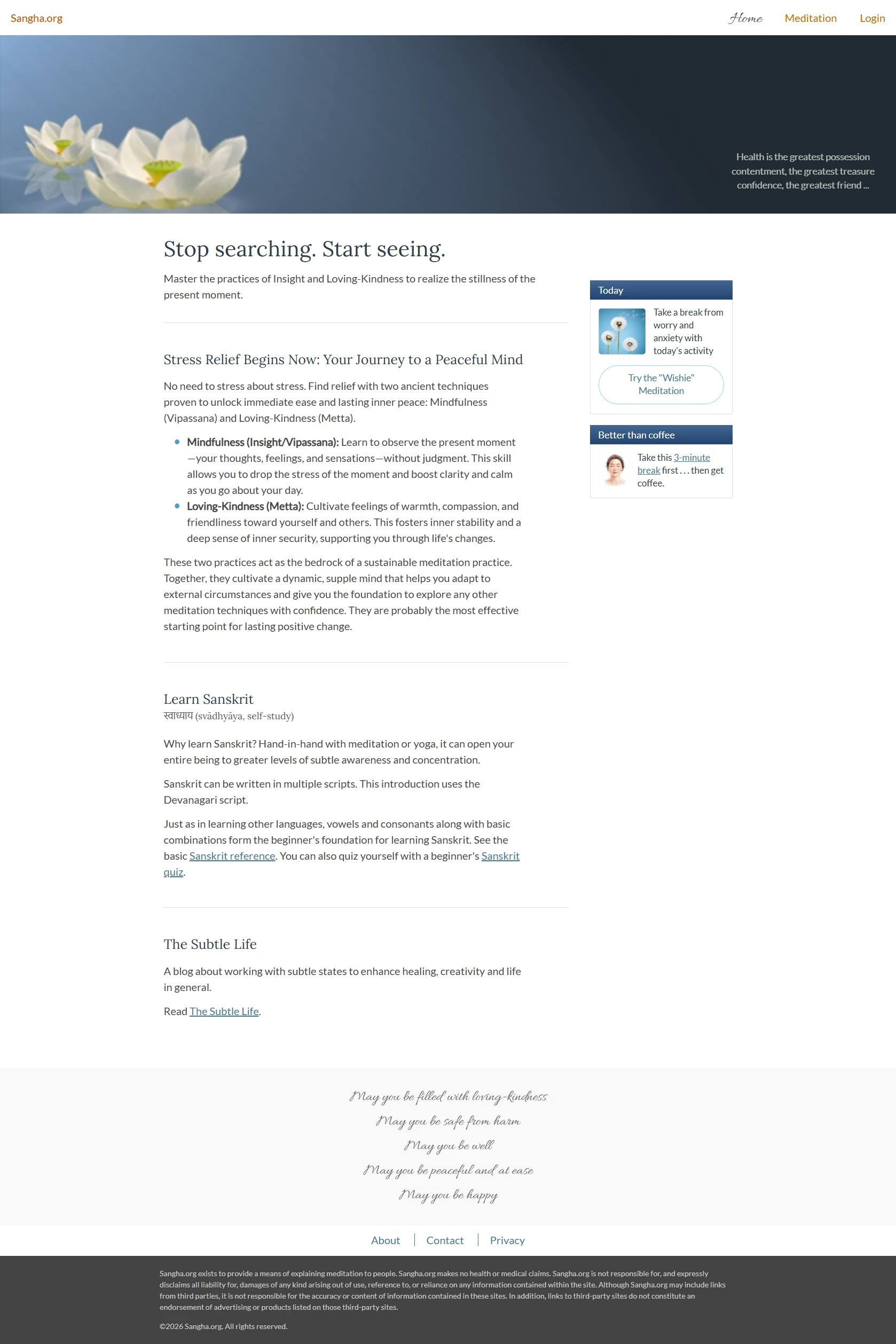
The original sangha.org landing page resembled a blog. The most active and engaging content sat in the aside, to the right. And the page lacked continuous fresh material that could attract or retain users interested in learning meditation.
Furthermore, the page did not clearly answer these user questions:
- What is this page about?
- What can I do here?
My challenge was to restructure this landing page to attract and retain users who would like to learn to meditate. With time constraints and without hundreds of videos or a tremendous amount of content, I had to find ways for how I might accomplish this.
The process
The idea for the landing page change was so strong that I could forgo wireframes and easily restructure the page content, adding the new banner and content. I performed a user needs analysis, determining that the site user may be someone who—- wants to learn meditation on the go
- wants to pick up bits of meditation in small learnable chunks (I chose this persona)
- wants to learn meditation beyond technology-reliance
- is curious about meditation and toying with the idea of attending a retreat
- wants a framework to learn meditation and maintain critical thinking, not go into a dreamy state
- wants to become more self-aware and live consciously
The approach
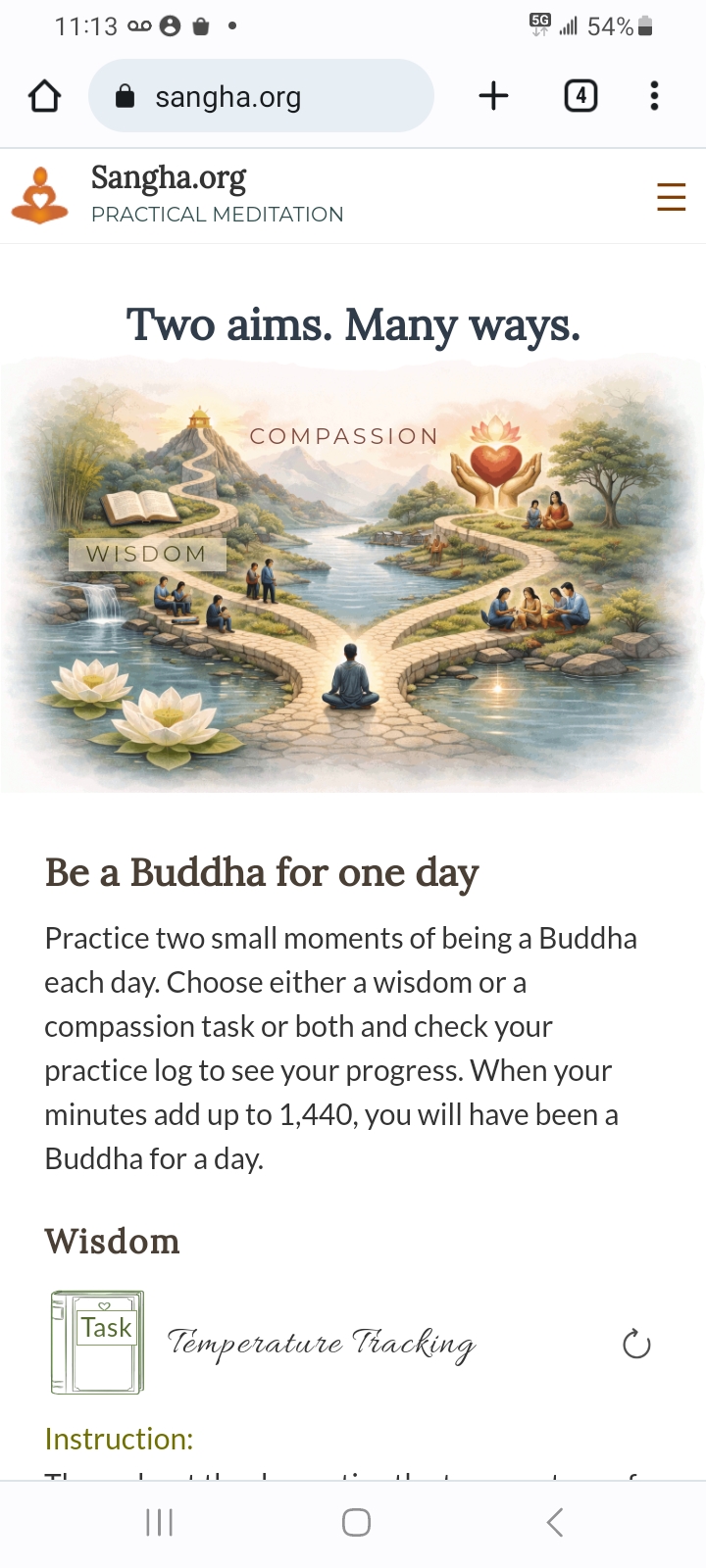
I performed a competitive audit, searching various meditation websites and reading literature, much of it confusing and leading to the conclusion that there are so many ways of doing the same thing. It inspired the tagline: "Two aims. Many ways." Though still vague, it began to address the user's question, What is this page about?
The solution
To fully answer the user questions, What is this page about? and What can I do here? I revamped the logo to include "Practical meditation," enhancing brand identity.
I strengthened focus on the primary value of the site by eliminating the right sidebar area, which increased the signal-to-noise ratio.
I enhanced the concept of "Two aims" by overlaying the titles, Wisdom and Compassion, across the new banner image and placed content after the banner—"Be a Buddha for one day" proposes a challenge which addresses the needs of a user who wants to pick up meditation in small learnable chunks. Via the two aims of wisdom and compassion, task descriptions are offered with a time—when the user chooses a task, the time gets added to their total. When the total equals 1,440 minutes, they will have been a Buddha for one day.
The result
A streamlined, mobile-responsive landing page that successfully establishes brand identity and purpose through a clear hierarchy and engaging, actionable content.
Going forward
- Content expansion: Build content for "Be a Buddha for one day" with a library of tasks to increase user retention.
- Community connection: Integrate some form of directory to connect users with teachers and/or retreats.
© 2025, Carol Robertson